Yorkshire Sport Foundation is responsible for West Yorkshire Sport and South Yorkshire Sport, 2 of the 45 county sport partnerships in England.
The main function of a county sport partnership is to encourage more people to take part in sport, and harness the positive impact that it makes on health, communities, and lives.
We worked hard on a new brand identity for the newly formed Yorkshire Sport Foundation.
Kick Off
West Yorkshire Sport and South Yorkshire Sport had been trading as separate entities, but will now be operating under the new umbrella name of Yorkshire Sport Foundation, a registered charity. The two separate brands will continue to operate and provide information to largely consumer audiences across their respective local authority areas.
The main goal for Yorkshire Sport Foundation was to promote sporting initiatives, programmes, services and opportunities to a broad B2B audience.
One of their key business objectives is to reduce the dependence on Sport England funding. This will be achieved through raising the profile and clarity of the brand, leading to closer engagement and successful long-term partnerships with organisations and corporate bodies, particularly through their CSR programmes.
Our brief was to create an identity for Yorkshire Sport Foundation that would embody the organisations vision and values, engage with the target audience, and integrate the two existing identities of West Yorkshire Sport and South Yorkshire Sport.
The Old Line-up

The old West Yorkshire Sport and South Yorkshire Sport identities were created as individual brands with no resemblance to each other. Early on we felt it important that these two existing brands were brought in to line with whatever the new Yorkshire Sport Foundation identity became.
Goals
Whilst the West Yorkshire Sport and South Yorkshire Sport organisations are targeting the consumer market, the Foundation will be focussed on delivering their B2B message, with the aim of generating sponsorship and funding.
With this in mind, the identity design needed to have more of a professional feel, without being too corporate.
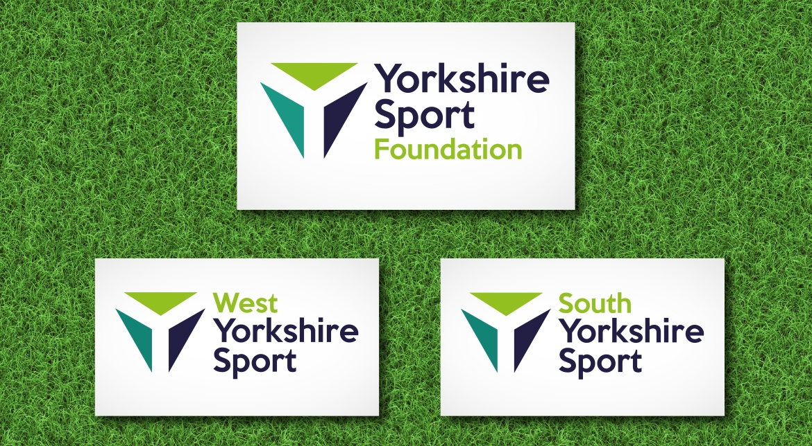
Taking that into consideration, we began by looking at producing a suite of logos for the three brands that would incorporate all the same elements, ensuring a consistent brand image.
The concept of Yorkshire Sport Foundation symbolised the coming together of three entities, something that is captured in the formation of the triangles in the brand icon.

This formation is not only symbolic of the unification, but its combination subtly forms the letter ‘Y’ for Yorkshire, the unifying element for both the old and new brands.
To retain an element from the existing brands, we included the colourways from the existing West Yorkshire Sport and South Yorkshire Sport logos, and combined them with a fresh complementary colour to reinvigorate them.
The introduction of a new font was also key to giving the logos the desired ‘mature’ look, without appearing too corporate.

In addition to designing a new suite of logo’s, we also produced a comprehensive set of brand guidelines to ensure consistency and clarity on future materials.
The guidelines outline how and where certain logos should appear, use of photography, colours, fonts and how the brand icon can be used in isolation or as a watermark.
Once the brand guidelines were complete, we went on to produce a set of branded stationery, an event invitation and programme for the brand launch event, as well as and a new responsive website.

This has been such an interesting project to work on – we can’t wait to watch the development of the Yorkshire Sport Foundation.
